Blind Debossed Logo Boxes: What to Approve on a Sample
Quick answer
For blind debossed logo packaging boxes, approve the recessed mark on the actual paper and box construction, at the final artwork size. A screen rendering cannot establish legibility, surface damage or the result after wrapping. Separate the desired appearance from the production settings: agree how the finished logo should look and feel, then let the converter establish the tooling and process through samples.
By Hugo He · Custom Packaging Consultant, MTT Packaging · Updated 2026-11-04
Packaging design reference. Final fit, materials and finish are confirmed on an approved sample.
At a glance
Specify the paper, final-size logo and assembled surface before approving blind debossed boxes. Use a practical sample checklist for clarity, depth and placement.
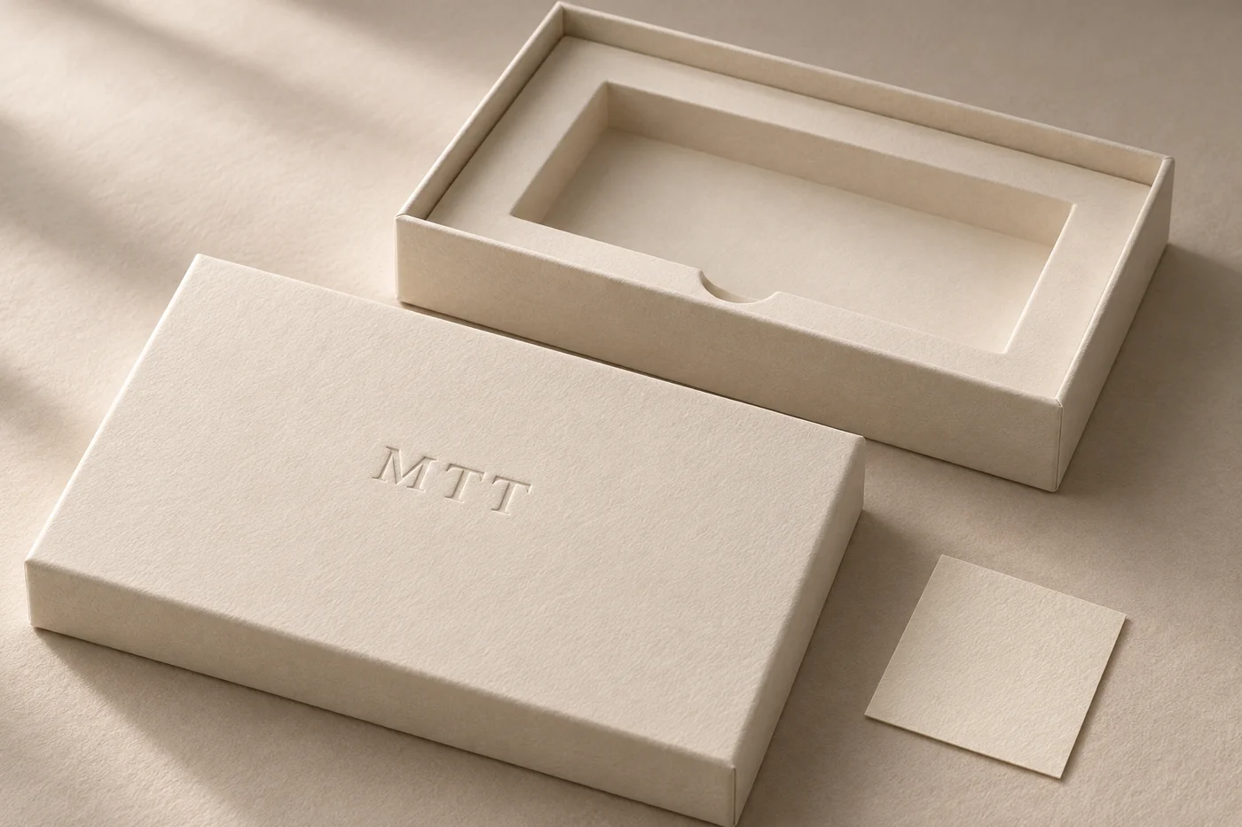
The ivory lid-and-base design shown here keeps the logo separate from the opening mechanism. The removable lid carries the mark; the base and paper insert handle the presentation of the contents. It is an MTT packaging concept, useful for discussing the finish without committing to a customer-specific product size.
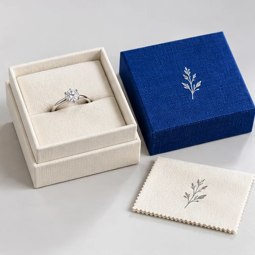
For a similar opening format, compare the engagement-ring lift-off box. Its product layout is a structure reference, not a promise that its existing materials will reproduce this finish.
02
Give the converter the complete material stack
“Ivory paper on a rigid box” leaves too much unresolved. Identify the wrap paper grade, colour, surface texture and any coating; specify the supporting board and the lining on the reverse. Ask whether the mark is formed before or after wrapping and how that choice affects its final appearance. Review the fully assembled lid even when an early paper trial looks convincing.
Fedrigoni’s Poliwrap data sheet calls for paper-specific printing pressure settings and advance assessment of varnishing or plastic lamination on that textured grade. It does not establish that the same settings work on every wrapping paper. The sheet carries a July 2013 revision date; request the supplier’s current specification before ordering that material.
Our practical recommendation is to change one variable at a time during sampling. If paper, artwork size and tooling all change together, it becomes harder to identify why a fine line has disappeared or why a surface has become polished around the mark.
03
Review the artwork at the size the buyer will see
Supply vector artwork and a dimensioned position on the approved lid drawing. Mark the logo width, height and orientation; identify the drawing revision. Keep the blind-deboss operation on its own clearly named layer. A grey shadow in a visual reference should not be interpreted as a printed grey outline.
Inspect small counters inside letters, narrow gaps, fine strokes and tightly spaced characters. Ask for a trial at the intended size and, if needed, a slightly simplified alternative. There is no universal minimum stroke or deboss depth that we can approve without the actual material and process.
For example, a fine script logo and a broad monogram may need different treatment even on the same lid. If the fine version loses definition, compare a larger mark or less intricate artwork before asking for more pressure. Use the artwork checklist to keep the drawing and finishing instructions aligned.
04
Use an acceptance sheet that describes visible decisions
Agree the viewing conditions before comparing samples: an ordinary face-on view, a side-lit view and a gentle tactile check reveal different things. Keep the distance and lighting consistent across samples. Raking light can make a shallow mark appear dramatic in a photograph, so do not approve it from that photograph alone.
Check
What to record
Reason to revise
Logo definition
Final-size approved artwork and physical reference
Small gaps close, letters merge or fine strokes disappear
Paper surface
Appearance around and within the recessed area
Unwanted cracking, tearing or conspicuous pressure marks
Placement
Dimensions from agreed lid edges and orientation
Mark looks off-centre after the lid is assembled
Reverse and lining
Appearance of the finished lid interior
Unwanted distortion or an unacceptable visible impression
Complete box
Lid fit, opening and customer removal sequence
The approved finish accompanies an unusable opening or insert
These are proposed review points, not measured MTT test results. Set project-specific acceptable limits with the converter and keep examples of both the approved result and any rejected defect.
05
Keep the insert decision separate from logo approval
A clean logo cannot correct a poor product fit. The concept uses an empty paper insert with removal access. The actual cavity should follow the product with its closure fitted, its loaded weight and the intended orientation. Confirm where it is supported and how the customer can lift it out.
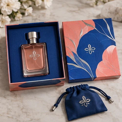
For fragrance, start with the single-bottle lift-off structure and its bottle cavity; for a ring or small accessory, the support and contact surfaces need a different brief. The insert comparison explains material-selection questions. Do not transfer an insert specification between those products simply because the lids look similar.
Keep retail presentation, carrying and parcel protection as separate requirements. No shipping performance can be established from this design image or from the logo sample.
06
Carry the approved finish through production and reorders
Holmen notes that paperboard construction limits the relief that can be achieved and that surface integrity matters during forming. Its guidance concerns paperboard; a wrapped rigid lid adds material layers and assembly steps that need their own trial.
Retain the signed physical sample, final artwork, paper reference, drawing revision and agreed inspection points together. Ask the production partner to identify the tool revision and relevant process record. If the paper or converter changes on a reorder, request a new comparison instead of relying on the previous screen file.
Quote the tooling and sample work separately where applicable, and state which charges are reusable. For larger custom rigid boxes, check whether changing the lid size or logo position changes the manufacturing route. The useful approval is a repeatable specification of the complete lid, not an instruction to make the impression “more luxurious”.
From guide to product
Compare packaging for your brief
Explore the opening, material and insert details for each design. These are options to review, not proof of a tested fit for your product.


 Bank Transfer
 PayPal