Matte, Gloss, Foil or Spot UV: Custom Packaging Finishes
Quick answer
Choose the finish around the visual or tactile detail you want buyers to notice, then test it on the intended paper. Matte, gloss, foil and spot effects respond differently to substrate and artwork. Review small details, joins and handling marks before combining processes. A screen mock-up cannot establish registration, adhesion or the final surface appearance.
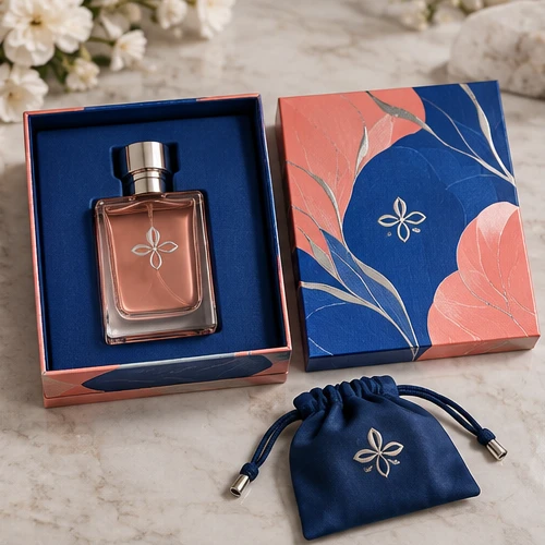
A matte surface gives a less reflective appearance; a gloss surface emphasizes reflections and printed colour. Coatings and film laminations are different specifications and should not be treated as interchangeable. Compare the gloss perfume design with the matte collagen set as visual directions, then approve physical paper samples. A screen cannot reproduce surface feel.
02
Foil adds a surface effect, not an opening structure
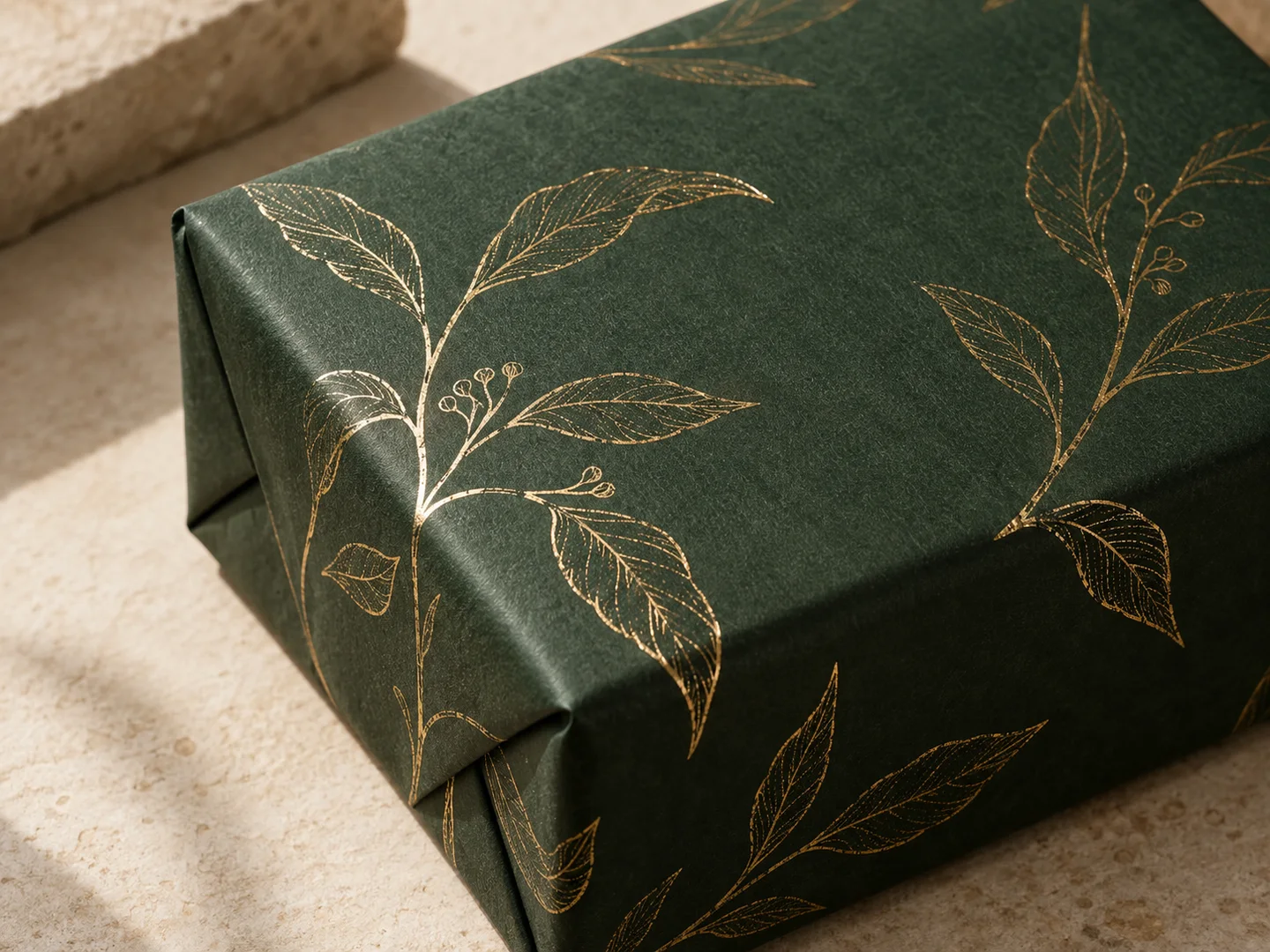
Foil can highlight a logo or outline, but the result depends on the foil, paper, tooling and production route. Keep delicate detail away from difficult wrap corners and discuss the artwork with the converter. The hexagonal gift design combines dyed paper and gold foil outlines. The cloth-wrapped ring design needs its own foil trial because cloth texture differs from smooth paper.
03
Emboss and deboss change surface relief
Embossing raises a feature; debossing presses it into the surface. Artwork, tooling, material thickness and assembly sequence affect the result. Ask how the effect is made in the chosen build and whether it affects the reverse surface. A border on the textured skincare wrap should be evaluated on that material rather than copied from a smooth-paper proof.
04
Spot UV needs a defined area and a compatibility check
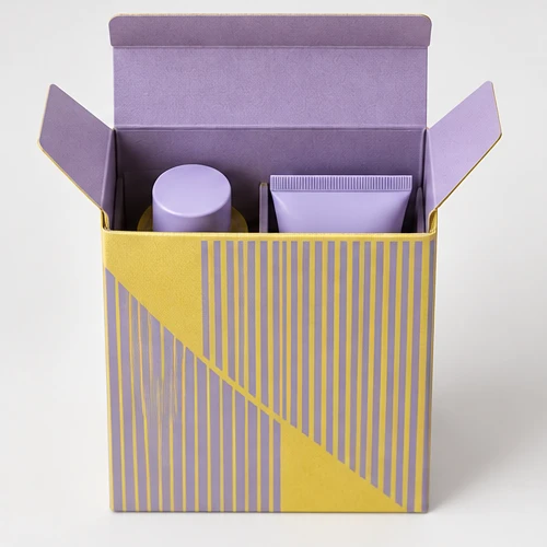
Selective gloss UV can contrast with a matte background. Supply a separate mask for the intended area and agree alignment requirements with production. Review adhesion, cure, fold behaviour and the visual result on the selected surface. Do not assume the same gloss on absorbent uncoated stock and coated paper. The collagen set is a reference for this surface contrast.
05
Match a set with physical references
A rigid-box wrap, bag paper and greeting card can show the same ink differently. Decide whether the priority is the closest colour match, the same texture or a deliberate contrast. Compare the assembled set under consistent lighting and retain the approved reference. Review ribbons and foil alongside the printed paper rather than choosing each from unrelated screen images.
06
Prepare artwork and quote each operation
Identify ordinary print, foil, UV and relief areas separately. Keep key information away from cuts, folds and wrap joins using the allowances agreed for that structure; there is no single safe-zone value for all packaging. Ask for each setup or tooling charge and sample scope. Send your artwork and preferred finish, using the brief checklist if the specification is still open.
Can I combine foil, embossing and spot UV?
A combination may be feasible, but the substrate, operation sequence, detail and registration need review. Specify the intended areas and ask for a sample before committing to production.
Will a gloss finish make any material look the same?
No. The base material, printed coverage and coating or lamination route affect appearance. Compare the actual materials.
Does more finishing always mean better packaging?
No. Choose effects that support the design and remain clear in production. Several competing effects can make the hierarchy less readable and add setup costs.
From guide to product
Compare packaging for your brief
Explore the opening, material and insert details for each design. These are options to review, not proof of a tested fit for your product.

 Bank Transfer
 PayPal