CMYK vs Spot Colour Packaging: Specifying a Violet Retail Bag
Quick answer
For CMYK vs spot colour packaging, separate the artwork’s photographic content from the colours that must remain consistent across a range. CMYK suits multicolour images; a spot ink is a candidate for a critical solid brand colour. The choice still depends on the printer, paper and finish. MTT’s violet skincare bag makes the decision concrete: review the broad violet panels, narrow pale stripes and folded top as different checks, then approve a physical result rather than a screen colour.
By Hugo He · Custom Packaging Consultant, MTT Packaging · Updated 2026-11-01
Packaging design reference. Final fit, materials and finish are confirmed on an approved sample.
At a glance
Choose CMYK or spot colour for packaging using an MTT violet retail bag. Review artwork separations, paper, pale details and finished sample approval.
Use the violet bag to identify the important colour areas
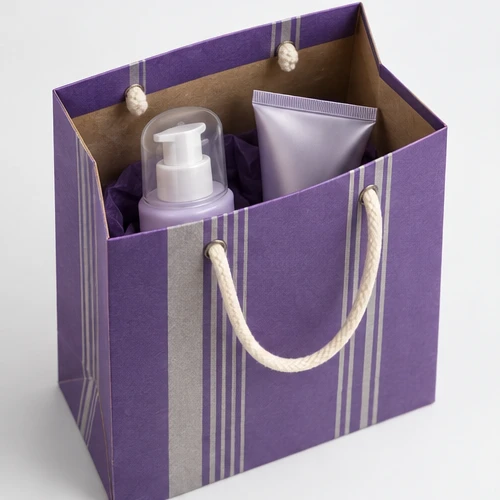
The MTT skincare duo bag combines broad violet panels, narrow light stripes and cord handles. Its brown interior is visible at the top. The artwork has two different risks: the large colour area makes variation noticeable, while the thin details need to remain clear after printing and folding.
The catalogue describes a two-colour print direction. That does not establish the final ink recipe, press or colour reference. Before requesting a production quotation, mark which colour is the brand priority and identify what the pale stripes should look like. A pale printed colour, an unprinted area and a metallic effect are different specifications.
02
Choose the printing route before converting the artwork
Adobe’s spot and process colour guidance distinguishes premixed spot inks from the four process inks: cyan, magenta, yellow and black. It also explains that the ink-and-paper combination affects a printed spot colour; its screen preview is not the physical result.
Artwork decisions to discuss with the printer
Artwork need
Route to compare
Approval question
Product photographs or many colours
CMYK process reproduction
Which profile and proof represent the intended print condition?
One dominant solid brand colour
A named spot-ink proposal
How does that ink appear on the selected paper?
Photos plus a critical brand solid
Process plus spot, if the printer supports it
Are the extra separation and setup justified?
Metallic or selective surface effect
A separately specified ink or finishing operation
Is the approved effect included in the quotation?
Do not convert an approved spot separation to CMYK merely to make the file look simpler. Ask what the selected production process will actually output, then preserve that decision in the artwork instructions.
03
Resolve what sits beneath the pale stripes
Look closely at where a pale stripe crosses the violet field and approaches a fold. Specify whether the stripe is printed, left open to the paper colour or produced with a separate effect. Where the chosen substrate needs an opaque base to achieve the target appearance, ask the printer to include and sample it. Do not assume every press or paper combination behaves the same way.
Request the critical artwork area at final size. A reduced screen mockup hides the relationship between a narrow line and the printed background. Review the sample after conversion too: a stripe that appears even on a flat sheet may look different around a crease or glued joint.
The artwork preflight guide handles dielines and production layers. Here, the narrower decision is which colour separations and effects should survive that handoff.
04
Approve the paper and finish with the colour
A colour reference without a paper reference leaves too much open. Record the stock, surface and any coating or lamination. Compare the printed panel before and after the chosen finish, then retain the finished version as the approval reference.
When matching a bag to a rigid box, place the two physical components together. Their papers and finishes may differ even when the artwork uses the same colour name. Ask which component is the master reference and what variation is acceptable. Agree the viewing conditions and any measurement method before comparing readings; do not add a universal colour-difference limit to an order without discussing how it will be measured.
Review separations, then review the physical sample
Identify the important solid colours and any images in the artwork.
Agree whether each named colour remains a spot separation or is converted for the chosen process.
Inspect the output preview for unintended extra colours, missing objects and overprint interactions.
Approve the relevant printed proof or ink sample for its stated purpose.
Review a converted, finished sample for folds, joins, rubbing and the relationship between panels.
Record the artwork version, material and finish beside the signed approval.
A file check can confirm that a separation exists. It cannot show how the cord attachment, folded top or finished surface will look in use. Keep those acceptance checks in the sample record rather than treating one PDF approval as approval of every physical detail.
06
Keep repeat orders tied to the approved specification
For reorders, provide the approved physical reference and the production file version together. Confirm whether the paper, ink system or finishing process has changed. If one has changed, ask for a targeted comparison before authorising the full run.
Compare quotations on the same print route. Include setup, additional separations, any opaque base and finishing work where applicable. A short run with a large setup component has a different cost pattern from a repeat run, but the actual figures belong in the supplier’s itemised quote.
The aim is a reproducible purchasing specification: one identified violet reference, one agreed treatment for the pale detail and a finished bag sample that both sides can inspect. Record those decisions through the sample approval process.
From guide to product
Compare packaging for your brief
Explore the opening, material and insert details for each design. These are options to review, not proof of a tested fit for your product.

 Bank Transfer
 PayPal